Many small businesses have a logo but no palette: the green on the sign isn’t the same as on Instagram, and the one on the website is a third shade someone picked by eye. Each piece may look fine on its own, but together they don’t look like the same brand.
Defining your colors takes an afternoon. These are the steps, along with what web accessibility guidelines say about contrast.
1. Start with what you already have
If your logo is already known, don’t invent new colors: pull them from it. With our logo palette tool you upload the image and get its main colors with their codes, without the file ever leaving your computer.
If you’re starting from scratch, think about your industry and your competitors: if every vet in your area uses green, a different color helps people remember you.
A word of caution: what you read online about “color psychology” (red makes you hungry, blue builds trust) is usually presented with more certainty than it has. Choose for differentiation and for how it looks, not from a table of meanings.
2. One main color, one or two accents, and neutrals
You don’t need to use every color equally. A structure that works:
- Main: the one that identifies your brand. It goes in the logo, buttons and key headings.
- Accent (one or two): to highlight something specific, like a sale or a notice.
- Neutrals: white, black or greys for backgrounds and text. They make up most of what people see.
A practical design rule is 60-30-10: 60% neutrals, 30% main and 10% accent. It’s not a law, but it keeps you from ending up with a page that shouts.
3. Check your text contrast
This is the step most people skip, and the one that most affects people reading on their phone in the sun or with tired eyes. The Web Content Accessibility Guidelines (WCAG), published by the W3C, require:
- Normal text: a contrast ratio of at least 4.5 to 1 with the background.
- Large text (18 points and up, or 14 bold; about 24 and 18.5 pixels): at least 3 to 1.
And for buttons, icons and form field borders, 3 to 1 against what’s next to them.
In practice: yellow or light blue almost never work for text on white. If your main color is light, use it for backgrounds and blocks, and put dark text on top. Our palette tool tells you, for each color, whether white or black text works better.
4. Don’t rely on color alone
The same guidelines ask that color not be the only way to convey something. A link that only stands out because it’s blue, a form error marked only in red, or “green price = on sale” don’t work for people who can’t tell colors apart well.
Add another cue: underline links, add an icon or text to errors, put a “Sale” label on the price.
5. Write down the exact codes
A palette without codes lasts until someone picks “a similar green”. Make a simple sheet with:
- HEX (
#1F6F5C): for your website and most design apps. - RGB (
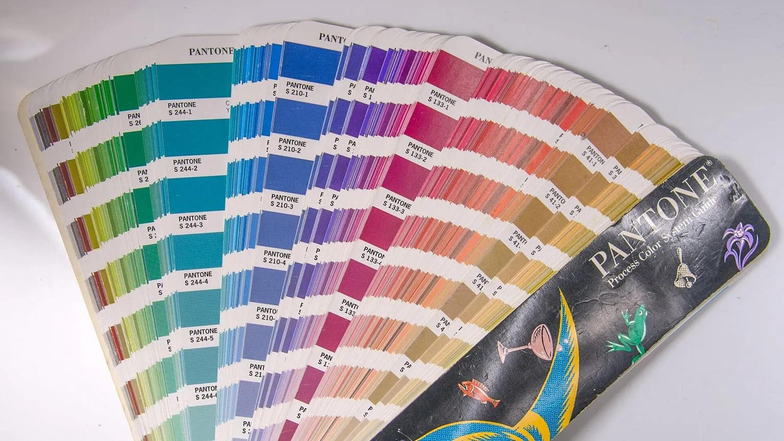
31, 111, 92): the same thing, written differently. - For print: ask your printer for the CMYK or Pantone conversion, because screens and paper don’t look the same.
Keep it where anyone designing for your brand can find it, including Canva if you use it.
6. Try it on real pieces before deciding
A palette that looks great in little squares might not work on a button, a post or a shop window. Before you settle, make three quick tests: an Instagram post, your site’s header and a business card or flyer. If something doesn’t read well or the colors clash, adjust now.
What’s next
Colors are one part of your identity: there’s also typography, photo style and the tone of your copy. If you’d like to build it with us, our content and identity page explains how we work.